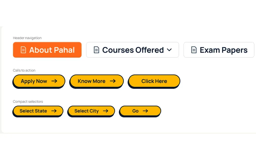
A full redesign of the digital presence of Pahal Design, India’s leading coaching institute for design entrance exams — built to serve its students and carry its creative atmosphere online.
Visit live site (opens in a new tab)
Pahal Design has been preparing students for India’s creative entrance exams since 1999. What began as a small classroom in Hauz Khas has grown into an institution with centres across ten states, built on classroom teaching, portfolio reviews and a strong studio culture.
When I approached the website redesign, I kept coming back to one thought: the website wasn’t the product; it was the gateway to the experience. The challenge was to bring the same credibility and approachability of Pahal’s offline experience into a digital space, while helping students find their way through its many courses and entrance exams.
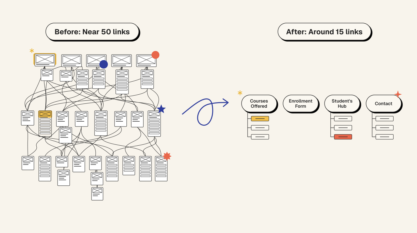
The old website had started to feel dated, both visually and functionally. With nearly 50 links spread across six main menu items and dropdowns up to three levels deep, finding information often meant clicking through layers of navigation. Courses, exam guides, college lists and results all competed for attention, without a clear path for students trying to explore their options.
It wasn’t just a visual refresh the site needed. It needed a rethink of how information was organised and how students moved through it. I wanted to shift the experience from an institute-led directory to something that felt more intuitive and student-led.
There was a lot the website needed to communicate. Pahal offered preparation for six entrance exams, alongside classroom and online programmes, test series, foundation courses and portfolio preparation. There was also years of useful content, student resources and institutional credibility that couldn’t simply be removed to make the site look cleaner.
The challenge was finding a balance: simplify the experience without stripping away useful information. Students needed to discover the right course or exam easily, while existing students still needed quick access to results, resources and updates.
I approached the redesign from the student’s point of view. Rather than making them navigate a long list of offerings, I wanted the website to help them understand where to begin.
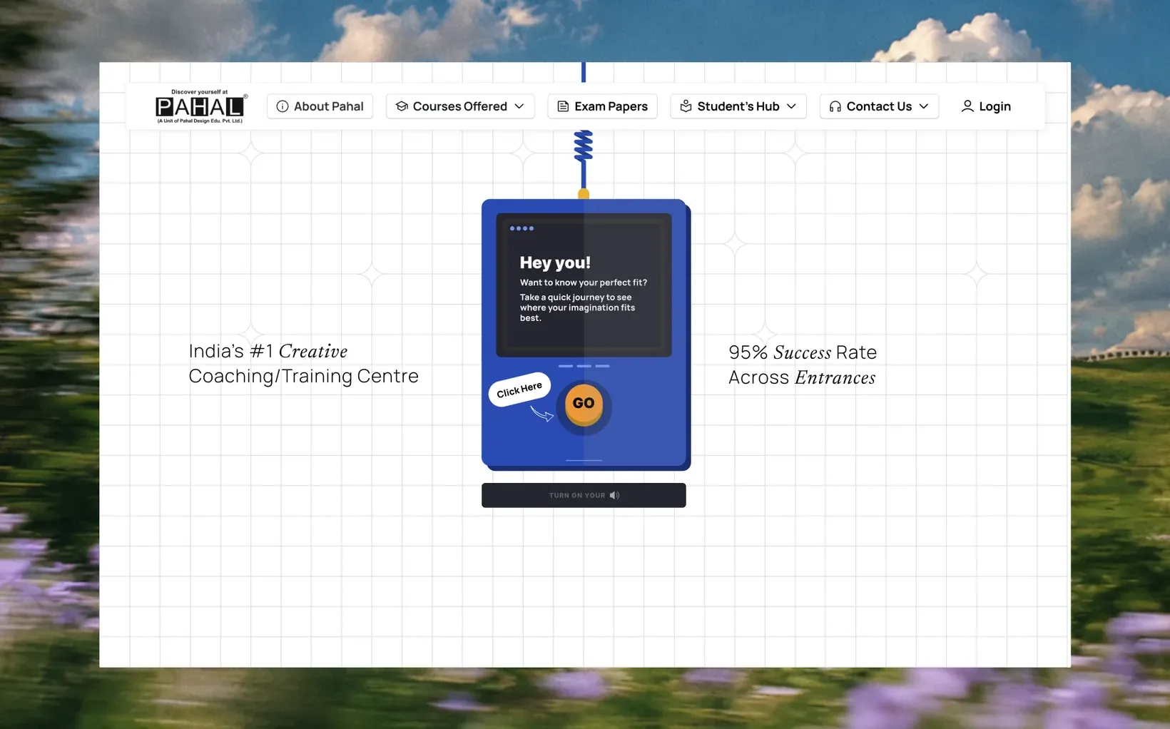
That thinking shaped the first fold. Most students arriving at Pahal are still figuring out which exam to take and what they’re suited for. So instead of opening with a conventional banner or course list, I introduced a playful console that asks, “Hey you! Want to know your perfect fit?” Set against a sketchbook-inspired background, the GO button invites students to explore rather than overwhelming them with information straight away.
I wanted the playfulness to feel welcoming, not make the institute seem less credible. So the console became the focal point, while the rest of the screen stayed clean and restrained. A rotating line of editorial text adds movement, and figures like 95% success rate, 22K+ students, 26+ years and 30+ centres reinforce Pahal’s experience. The invitation creates curiosity; the numbers build trust.
The old navigation had nearly 50 links across six menu items, with dropdowns up to three levels deep. I reorganised it around what students actually came looking for.
I took an iterative approach to the design system. The homepage was where I first established the visual direction, bringing together Pahal’s four brand colours and setting the tone for the rest of the experience. As the remaining pages took shape, I developed reusable components around their actual needs, allowing the system to grow alongside the website rather than designing every component in isolation.
Once the visual language was established, I documented the styles and components across six key screens. This gave me a clearer picture of how the design language was being used and helped distinguish between existing design decisions and areas for refinement. It also highlighted opportunities to bring greater consistency to colour tokens, component specifications and interaction states.
The trade-off was a more iterative process rather than a fully defined system from day one. In return, the components and patterns were shaped by real page requirements and could be refined as the website evolved.
Type 13 steps
Aa
Newsreader displayManrope interface
Colour 4 hues
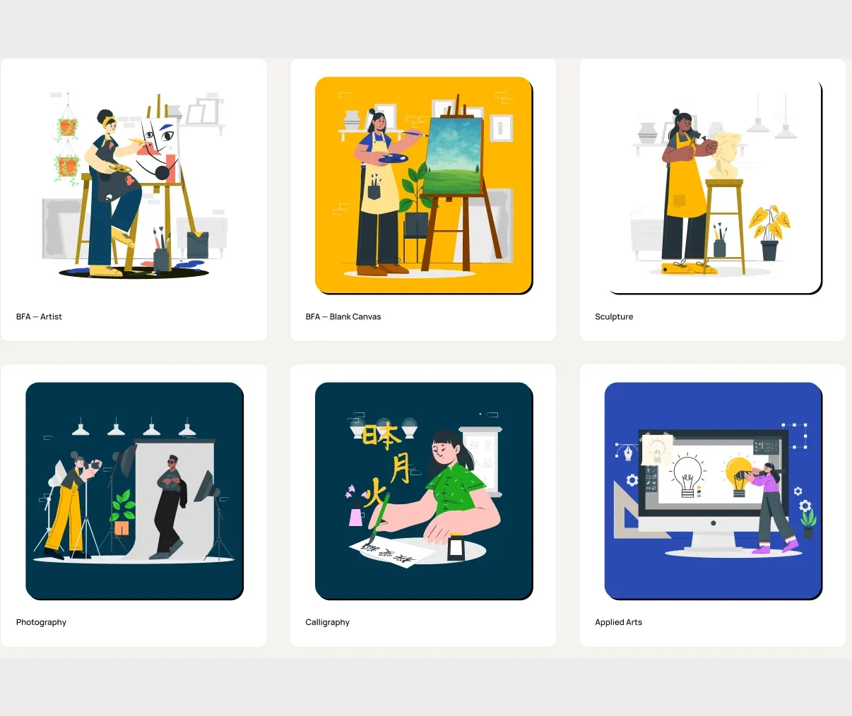
Library 136 assets
80
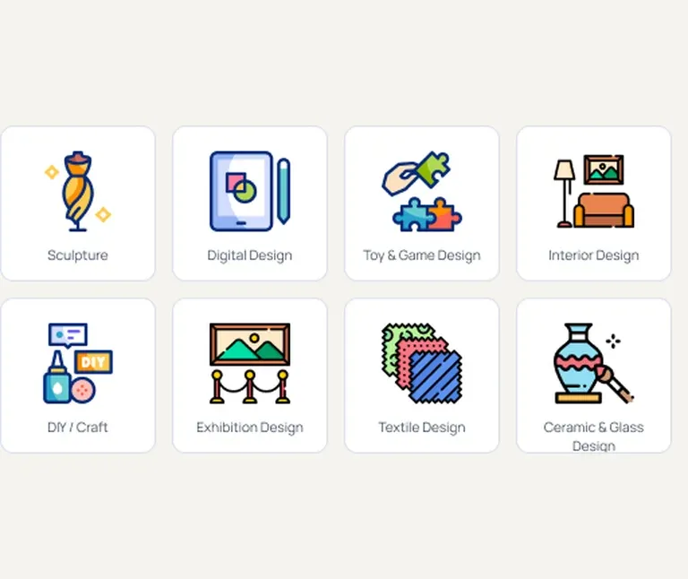
Design icons
16
Category icons
40
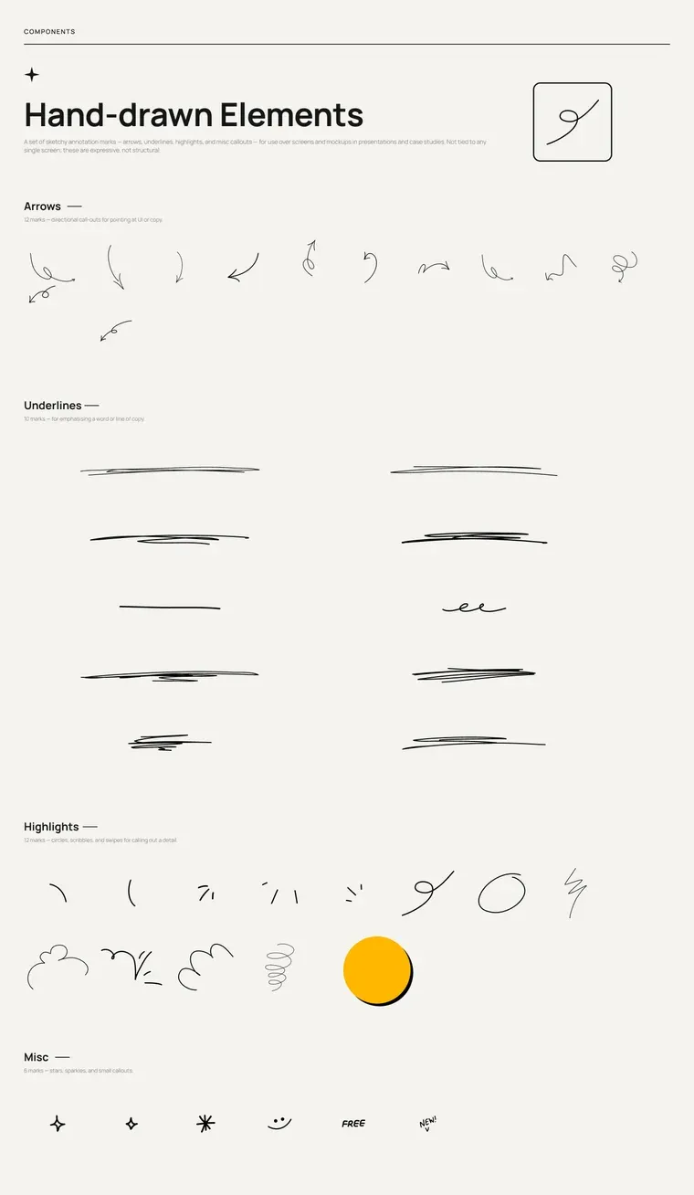
Hand-drawn marks
Icons 16 categories
The redesign transformed Pahal’s website from a traditional institute directory into a more engaging, student-focused digital experience. A playful visual identity, contemporary layouts and interactive elements made the website more inviting for its 17–22-year-old audience, while simplifying navigation from nearly 50 links to around 15 clearly grouped options made courses, exams and resources easier to discover.
Visit live site (opens in a new tab)Looking back, I’d bring students into the process much earlier. While the redesign was built around their needs, testing early concepts with actual students could have helped validate the navigation, course discovery journey and playful first-fold experience before moving into the final designs.
I’d also define success metrics earlier in the process. Beyond making the website look and feel better, I’d want to understand whether students were finding courses more easily, exploring more pages and moving from discovery to enquiry. It would have made the impact of the redesign easier to measure, not just see.
Scheduling a follow-up in Onebox, from finding the reply to confirming when it goes out.
Mapping the customer journey and app flow for an event vendor marketplace.
Press ESC to go back to the previous page.